The map above shows where you can and can’t find sheep in Europe.
Probably one of the few maps that highlights, Wales, Northern England, the North and East of Ireland, Sardinia, and Greece.

Cereal Secrets
The map above shows where you can and can’t find sheep in Europe.
Probably one of the few maps that highlights, Wales, Northern England, the North and East of Ireland, Sardinia, and Greece.
The beautiful map above shows the split in Wheat vs Rice preference in India.
Overall, Indians prefer rice to wheat.
However, there is a big range from Rajasthan (population 68 million) which overwhelmingly consumes more wheat than rice to Mainpur (population 2.9 million) which consumes exclusively rice.
The map above shows how much of each state is taken up by Corn (maize) fields. Iowa is the biggest producer of Corn and devotes 37% of it’s entire land area to the crop.
Other big producers include:
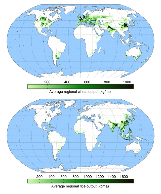
The two maps above the difference between where wheat and rice are grown in the world. The top map shows wheat and the bottom one shows rice.
Usurpingly, Europe and North America produce a lot of wheat whereas South-East Asia produces a lot of rice.
However, what is perhaps a bit more surprising is the split within both India and China. Let’s take a closer look:
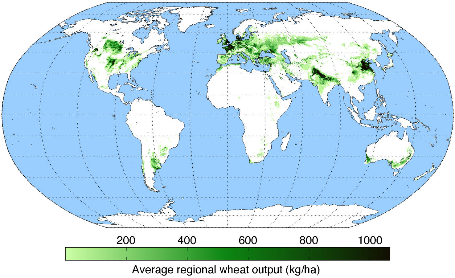
The map above shows only wheat production. Zoom into either India or China and you’ll find they actually produce a lot of it. In the case of China it’s concentrated in the North, whereas in Indian it’s in the Nort West.

The map above shows Rice production by country. Again in the case of China it’s concentrated in the south, whereas in India it’s in the South East. You can see the split in India more clearly in this map.
Finally, both South America and Africa are notable in their absence from both maps.
The beautiful map above shows the primary crop in each region of France.
The crops are: